Atelier We Are Makers is a multidisciplinary design workshop. It is a part of a Tactile Studio group, a globally inclusive design agency that creates accessible projects for institutions, museums and galleries.
Atelier WAM manufactures unique prototypes and objects: large-scale replica models, hybrid objects, sculptures, hand-helds, interactive models and sensory devices. The workshop combines digital precision (2D and 3D printing, laser cutting, finishing) and manual dexterity to produce high-quality objects, from a one-off item to limited series.
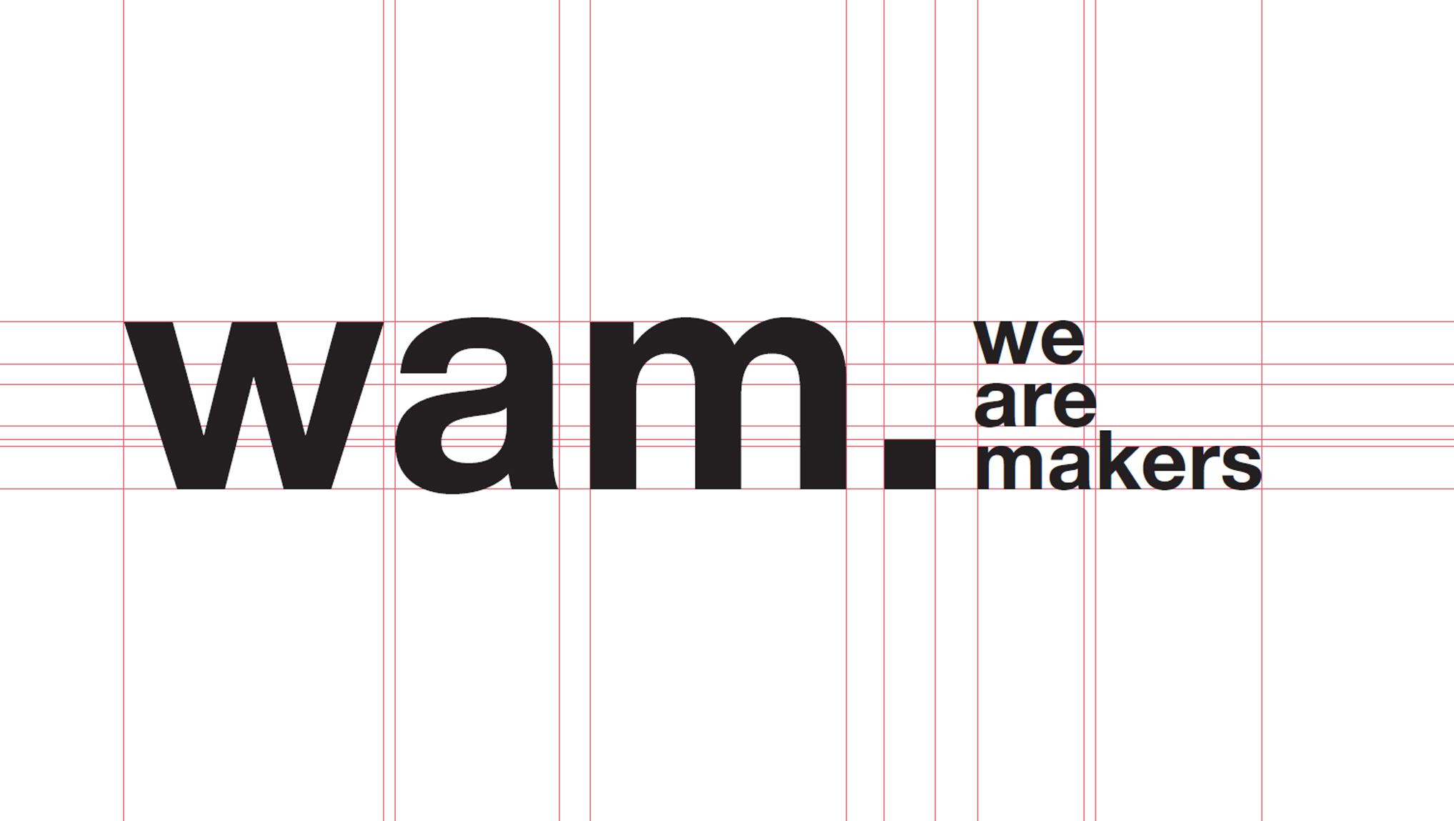
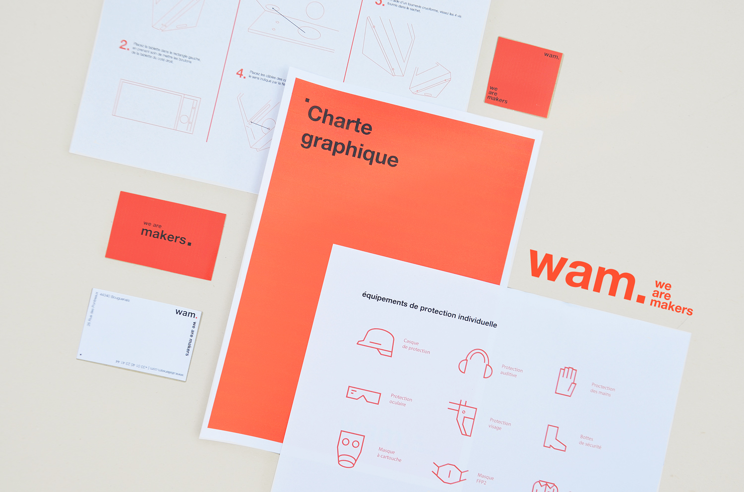
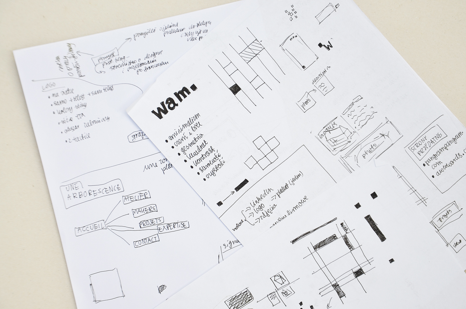
During my internship in Tactile Studio in France, I was working on a visual identity of atelier We Are Makers. The only thing that have already existed was the logo. I put the logo on the grid: that was my starting point. The most eye-catching thing was a small square. I decided to use it in the identity as a geometric motif.
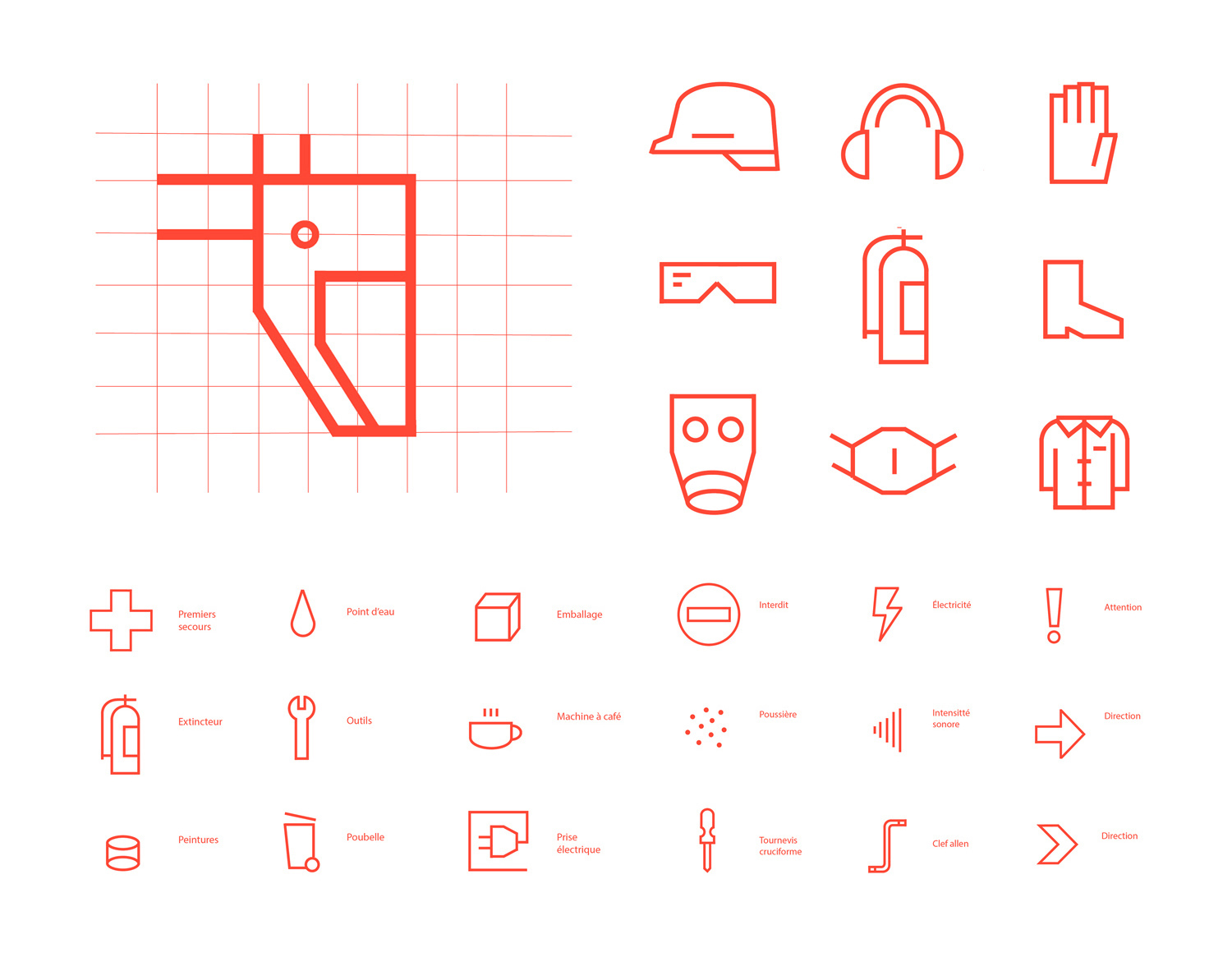
I created pictograms for the atelier space. They are based on a geometric, square grid. As a color for brand identification I used vivid orange which refers to creativity, communication, artisanal work and positive energy.
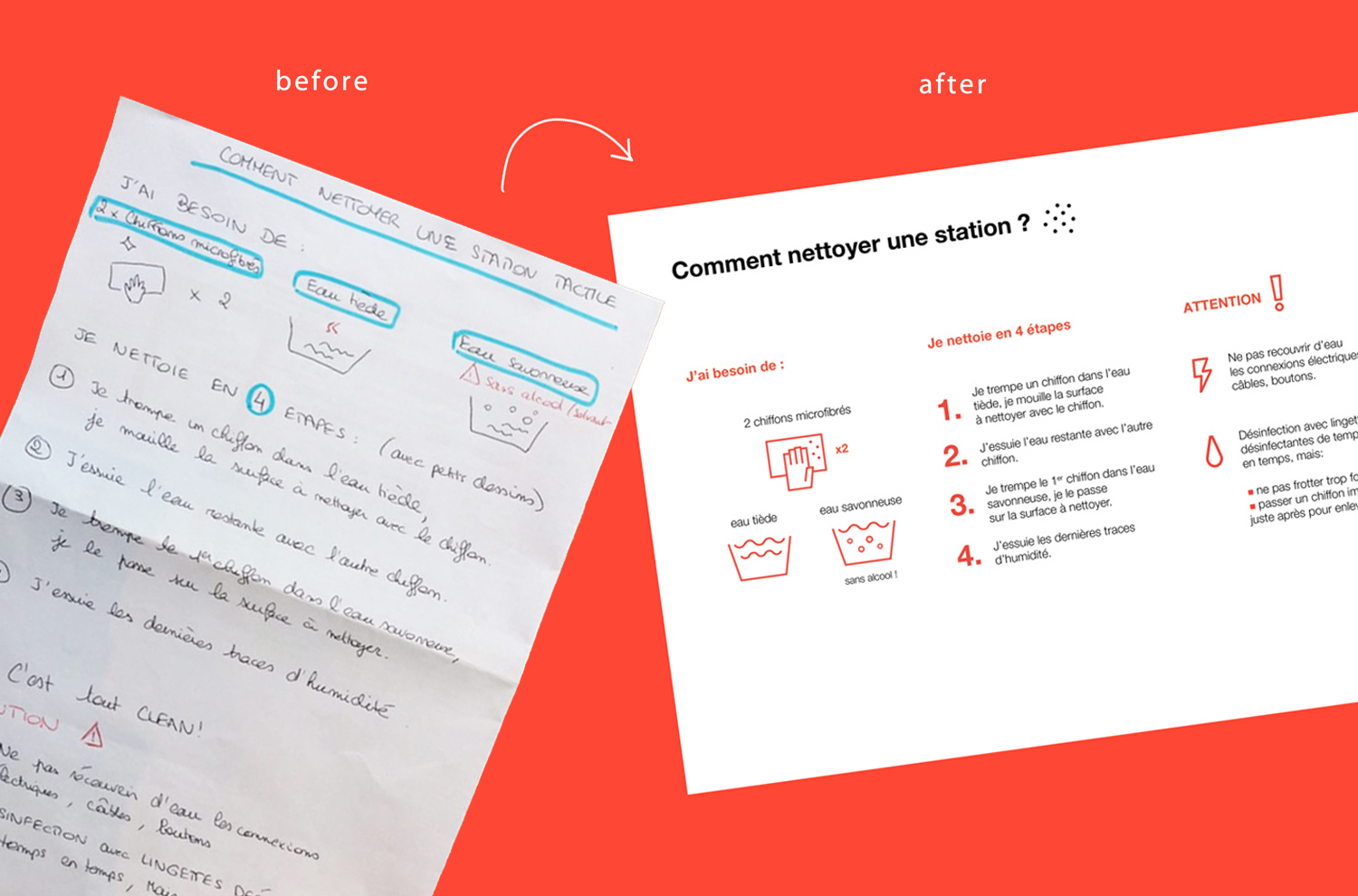
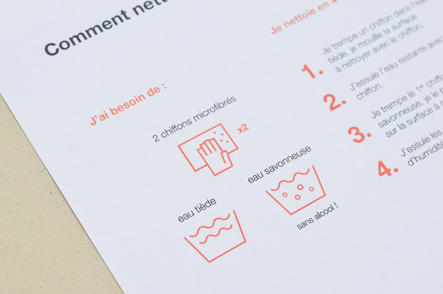
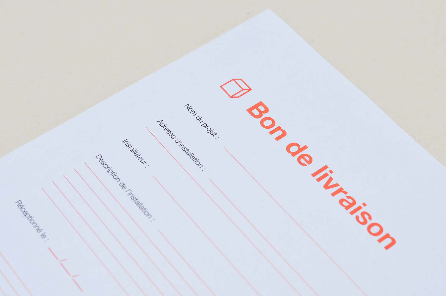
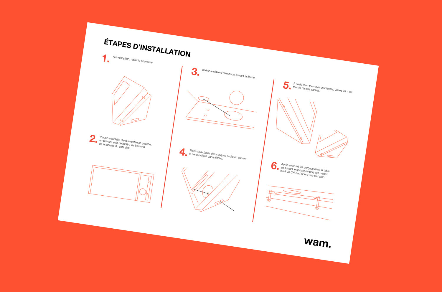
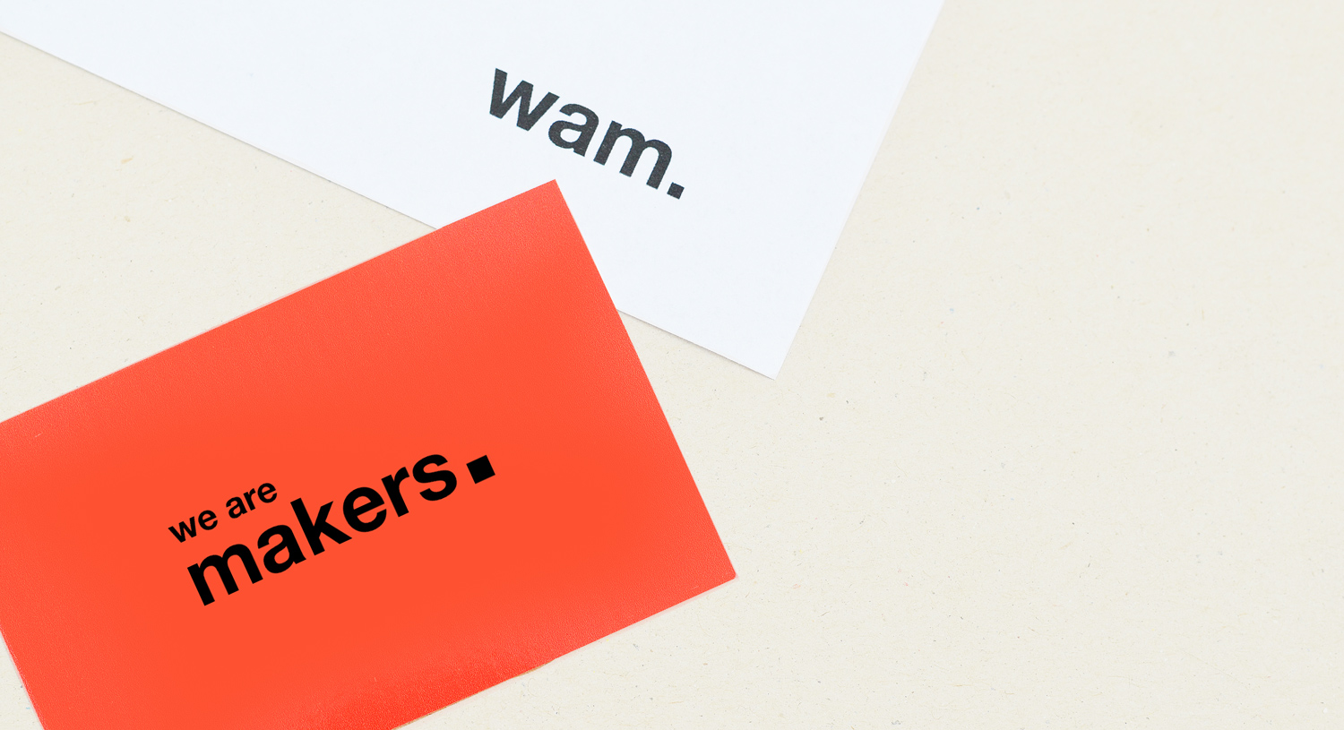
For atelier We Are Makers I designed business cards and documents: installation guide, station cleaning instruction, delivery note.
Let’s see my other graphic design projects. I’m also on Instagram.