
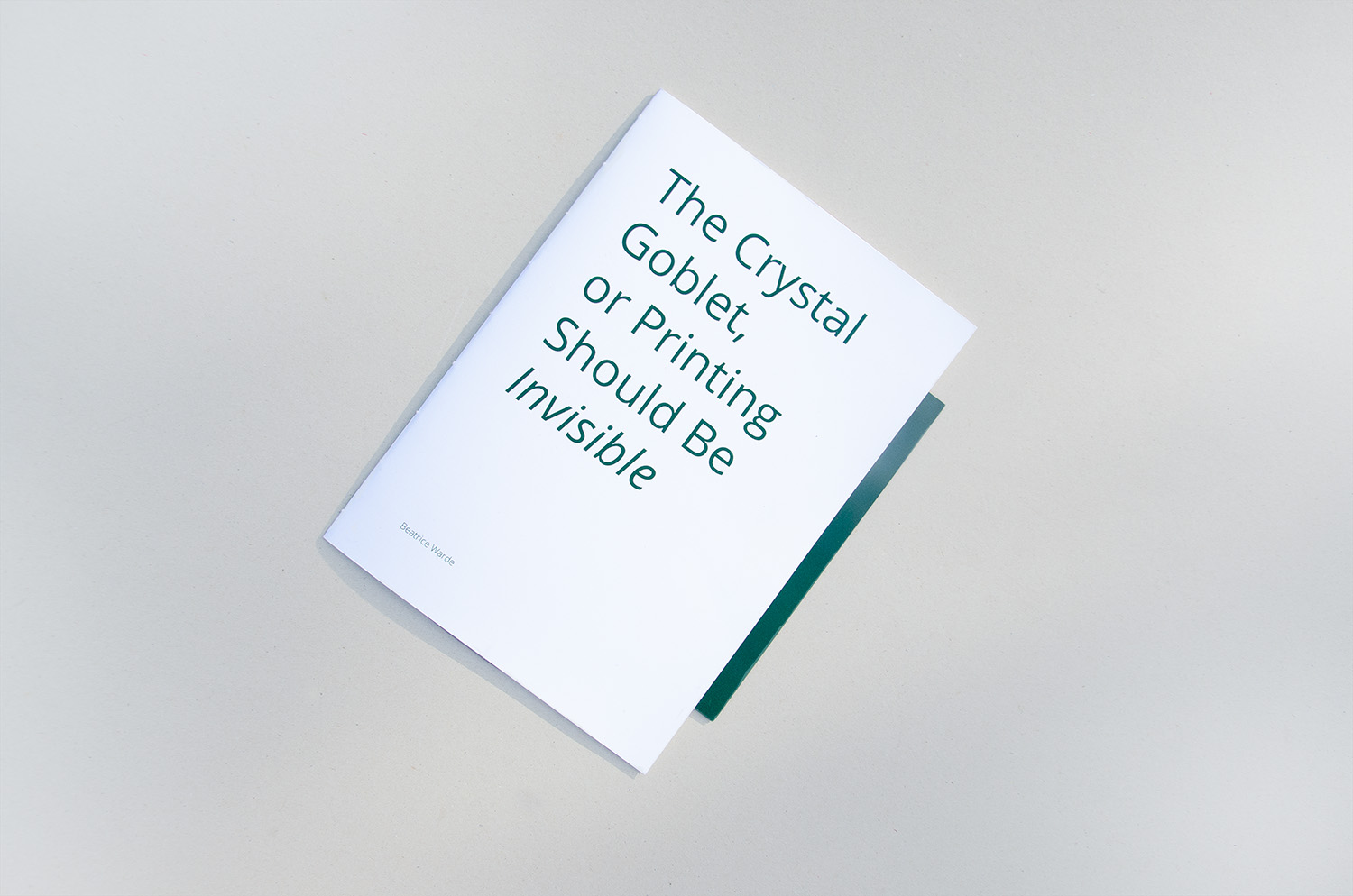
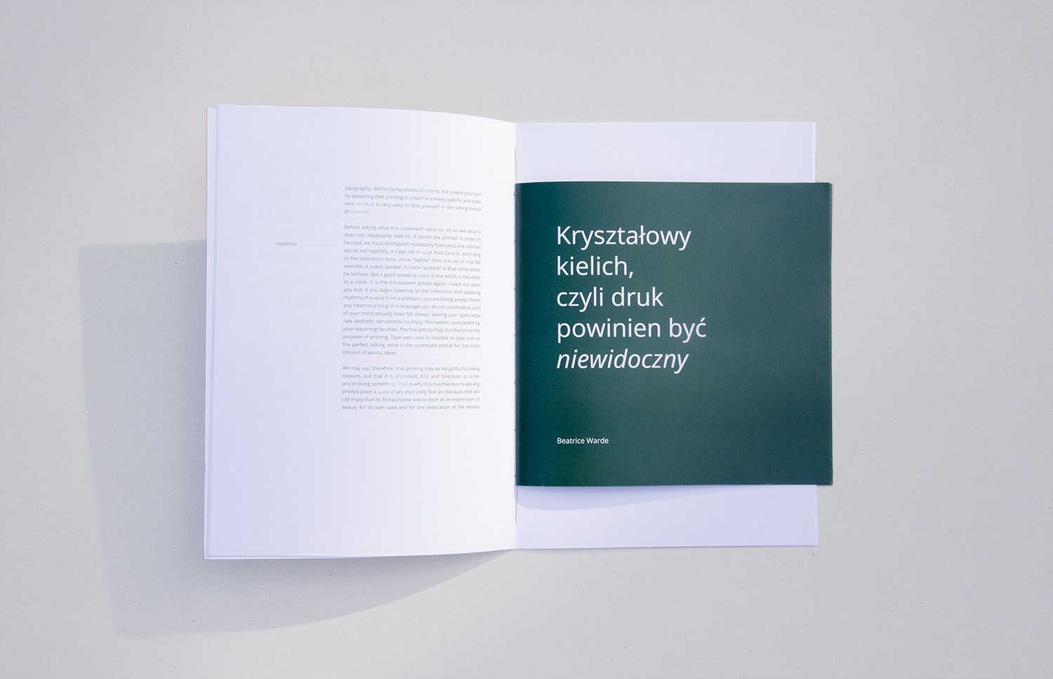
I designed a bilingual publication for the text The Crystal Goblet, or Printing Should Be Invisible by Beatrice Warde. The publication consist of two parts: the bigger one is an English version, and the smaller one is in Polish.
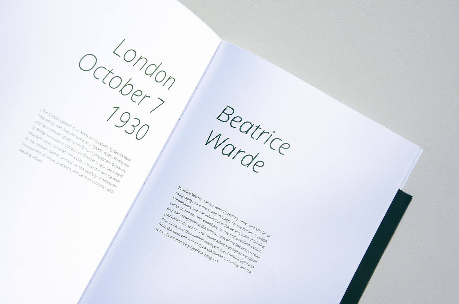
The Crystal Goblet, or Printing Should Be Invisible is an essay on typography written by Beatrice Warde. The essay was firstly presented as a speech given to the British Typographers’ Guild in London, on October 7, 1930. The title crystal goblet is a metaphor for typography that should be clear and lisible.

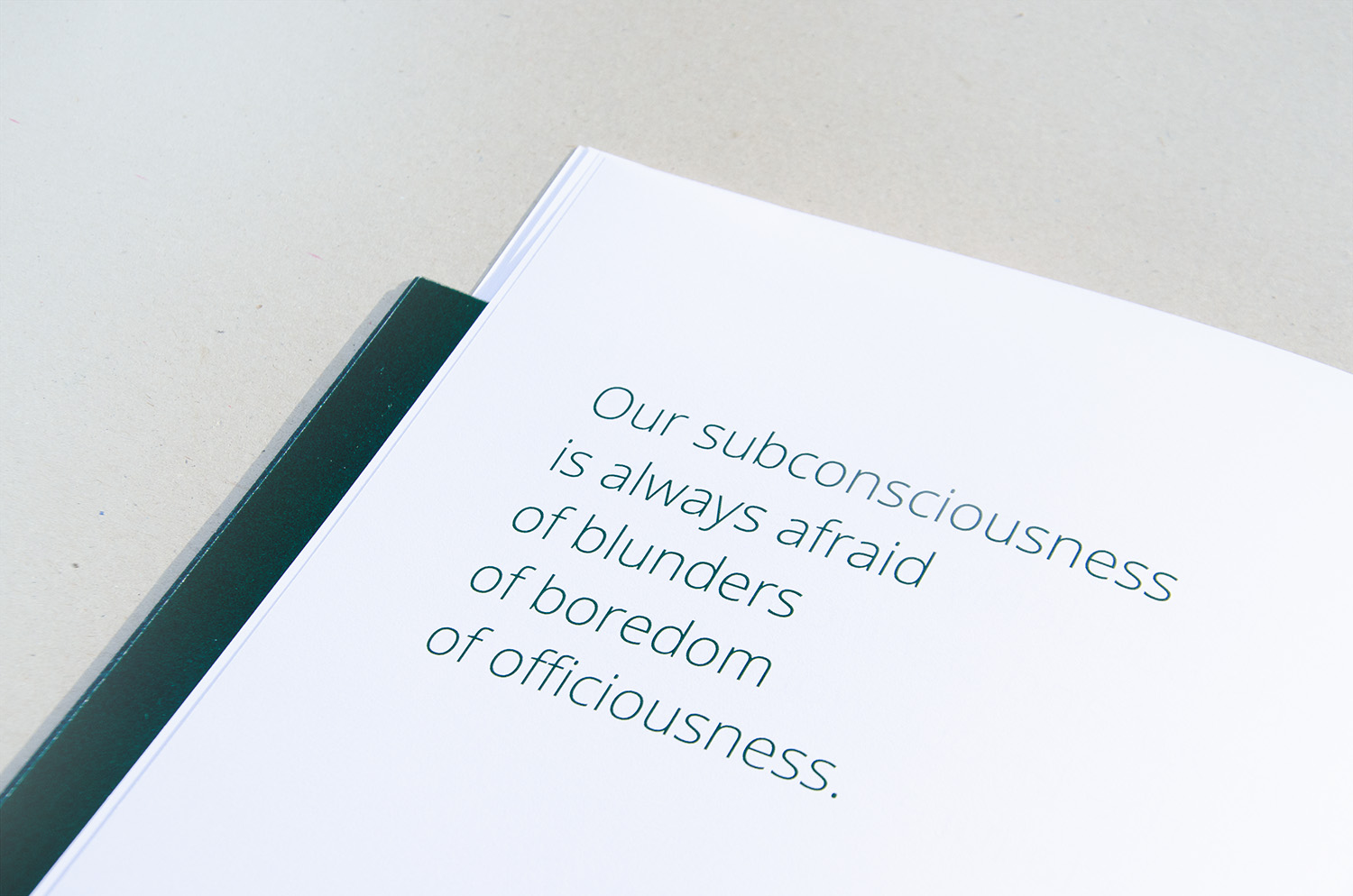
In my work, I aimed to create a minimalistic layout that facilitates reading Beatrice’s Warde essay. My goal was to convey the author’s message through my design. To achieve clear layout I decided to use large margins. I empahised the quotes and key words from the text. As a typeface I used Open Sans.
To diversify languages I decided to use two diffrent values such as size (A4 and 21×22 cm) and colour (negative and positive). The main language is English. Therefore Polish version is sewn into the middle of the English publication.


Let’s see my other graphic design projects. I’m also on instagram and behance.